
Stop.
Stop what you’re doing right away and look around. How many colors can you spot? Do you think these colors can possibly have an influence over our train of thought? The way we function? Maybe, even trigger emotions?
How many times have we heard stories where great writers and artists have had creative blocks and an idea strikes out of nowhere like a bolt of thunder after having changed environments?
Remember the moment you’ve been on a hilltop after a great climb surrounded by greenery so serene, it immediately instills a sense of calm with good thoughts reverberating in your mind? We’re sure you’ve experienced this.
We walk around every day moving from one place to another reacting and feeling differently. While our state of mind and circumstance are substantial factors that impact our internal responses, there is another component that is usually blindsided by most of us.
It’s stimulation.
Every space is nothing but an amalgamation of articles that constitute a color. When color is transmitted from the eye to the brain, the brain releases a hormone affecting emotions, mental clarity, and energy levels. Research and studies have confirmed that the fusiform gyrus of the temporal lobe is the brain center of color perception, and “perception is a keynote to dynamic perspectives.”
That said, a majority of us spend a big chunk of our life in our workspaces. It is imperative for companies to ensure that they design and build the perfect spaces for their employees to bring the best out of them. It doesn’t end there. As big businesses, you’re sure to have clients moving back and forth to seal the deal. The outlook speaks volumes in creating the impression right.
To bring about the ideal look and feel is a rare craft.
Here’s where interior designers like us save the day.
Colors being an important tool in the art of interior designing, it should always be kept in mind that the choice of hues should be paired consciously with the functional aspect of every chamber in your office. Form follows function, isn’t it?
Simply, read the room.
While it’s an exceptional idea to use hues to positively impact workspaces, let’s first discover how prominent colors in the whole color spectrum have a psychological effect in achieving this.
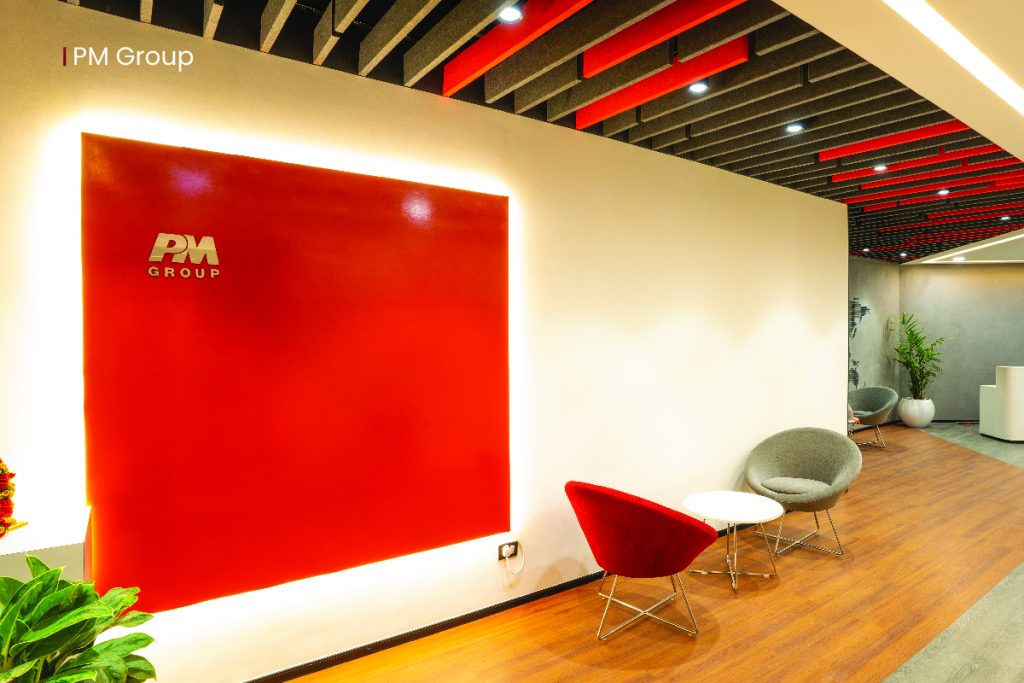
The Bold Red
Intense and confident, it’s undoubtedly an attention grabber. The bold red invokes a surge in passion and energy and is best suited for high-energy creative environments. It brings about certain physical effects in our body like an increase in heart rate, and blood pressure, further leading to an increase in appetite which is why it’s prominent in food courts and dining areas. Nevertheless, popping too much red can cause headaches. Toning it down a notch with neutral colors creates the optimum space.
Here’s a glimpse of interior designs we created for PM Group.
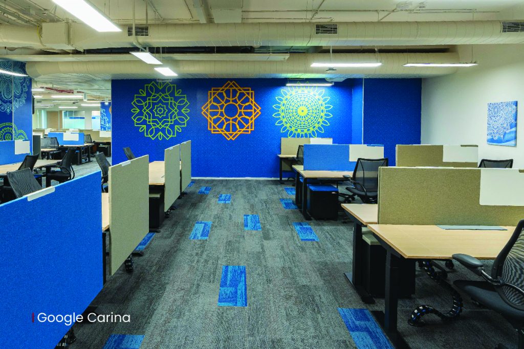
The Relaxer Blue
Imagine the pleasure that comes from sky gazing and being surrounded by deep blue sea waters. That’s the kind of calming effect it adds to the space. In terms of physical effects on our body, it is the exact opposite of the color red. Slowing the heart rate, and decreasing the blood pressure, soft blues help employees in keeping their focus and concentration intact for long periods. On the other hand, strong blues are a promoter of clear and intellectual thought portraying a confident aura.
Take a look at what we crafted for Google Carina.
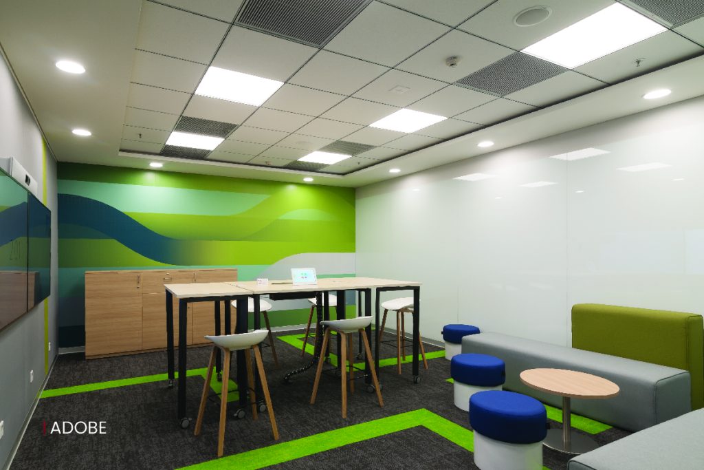
The Tranquil Green
Green tones are the flag bearers of serenity and tranquility. If you want your space to breathe freshness, a touch of green with tones should be your go-to. It emphasizes the balance between your mind, body, and emotions leaving behind a soothing feeling. Being the popular choice in workspaces, it ensures your employees have a peaceful state of mind letting all the creative juices flow.
Bring nature back in as we did for ADOBE.
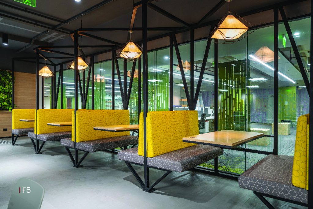
The Warm Yellow
A splash of yellow never fails to exude a bright, sunny, and fresh ambience. It is sure to trigger hormones that are associated with fun and happiness. It keeps the mindset of your team motivated and optimistic through every obstacle you tackle in workspaces. While it can be very beneficial to your employees, it also plays an active role in making your clients feel welcomed and positive. Using it in moderation will certainly create a positive effect.
Here’s a sneak peek of our F5 project in a yellow backdrop.
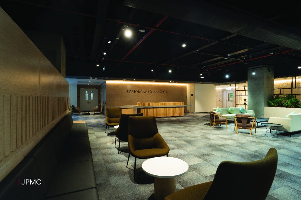
The Classic Black
The epitome of luxury.
It’s a fashionable tone that signifies power and control. Due to its color properties, it also acts as an absorber of natural light creating lavish and bright workspaces. Its flexibility in going along with any color makes it one of the versatile hues in every interior designer’s palette.
Here’s a glimpse of our project JPMC in moderate shades of black.
With this, we’ve got to the bottom of how colors impact energy and productivity levels and evoke emotions, and patterns in our minds. Nevertheless, when you pop up your workspaces with colors, customize it based on your brand, and business.
That’s where the magic happens!
Found it useful?
Share our blog and let us know what you think in the comments!